Founded on September of 2021, operated by the eccentric, self-taught artist Mike Lewis, where experimenting with every medium, from animation, comics, illustration and painting, are welcome, while still bridging the line between fine art and commercial art.
More often than not, a majority of people I've talked to will always have little to no familiarity with UPA (United Productions of America) outside of, of course, Mr. Magoo, (voiced by Jim Backus of Gilligan's Island fame).
Jim Backus, original voice of Mr. Magoo
Okay, now for a short intro:
*UPA was an animation studio founded in 1941 (as Industrial Film and Poster Service) by John Hubley, former Disney animator who left during the 1941 Disney Strike.
John Hubley and his wife, Faith Hubley
Mr. Hubley has expressed his frustration over the ultra-realistic style of Disney animated productions, feeling that animation didn't have to be an overt imitation of real-life. Part of what also inspired the UPA style was Chuck Jones's The Dover Boys, which was considered to be one of the first cartoons to break away from the "Disney look" (over what was then known as the "modern cartoon" look by The Dover Boys according to animation historian Michael Barrier), proving to Hubley and everyone else that animation could experiment and simply didn't have to follow one way of doing cartoons. And the rest is history.
The Dover Boys at Pimento University; or, The Rivals of Roquefort Hall (1942) - Chuck Jones
"In 1943, Hubley saw the Warner Brothers cartoon The Dover Boys. It's linear drawings and stylized images, so different from anything else done at the time, helped prove to him that his thoughts on animation were correct. Hubley would often speak fondly of the way Jones used new animation techniques on a story of comedy on a human level, as opposed to the typical cartoon of comedy for comedy's sake."
Noell K. Wolfgram Evans (Animators of Film and Television, pg. 18)
Chuck Jones had already shown his interest in breaking away from the traditional Disney style he had done in his short prior to The Dover Boys and The Draft Horse to create a revolutionary style that predated UPA, equal courtesy to background artists' John McGrew and Gene Fleury.
Case of the Missing Hare (1942)
Odor-Able Kitty (1945)
The Unbearable Bear (1943)
He also moonlighted over at UPA to direct a World War II-themed short film sponsored by United Auto Workers, called Hell-Bent for Election (1944), written by Robert Lee. The film gave Jones a bigger opportunity to experiment more freely with flat, stylized graphic designs, something he was almost fired for doing when he did The Dover Boys.
What one needs to remember is that, before Hanna-Barbera and their infamous limited animation (not riffing, I love their works), there was UPA, and before UPA, was The Dover Boys, which helped showcase a different approach to animation and it's capability to unique storytelling, humor, visuals and character design that's possible ONLY in the world of animation, and UPA showcased this even more. UPA's films had a quite an audiences in mind, whereas Disney was often geared towards a more family-friendly audience, Warner Bros. and MGM were fixed to making the cartoons for themselves but still entertained young and old alike, while UPA can either have their films made for children (Madeline, Gerald McBoing Boing), adults (Fudget's Budget, Rooty Toot Toot and the groundbreaking The Tell-Tale Heart, the first animated film to receive an X-certificate in the UK from the British Board of Film Censors) or both in many cases.
Madeline (1952) - Bobe Cannon
Gerald McBoing-Boing (1950) - Bobe Cannon
Rooty Toot Toot (1951) - John Hubley
The Tell-Tale Heart (1952) - Ted Parmelee
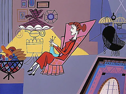
Because the popularity of Disney, Warner Bros. and MGM, UPA somehow became lesser-known, even among a good amount of animation buffs, despite playing an important role in the history of animation and introducing a stylized minimalistic sophisticated style, influenced by mid-century art, that became the standard of 50s and 60s animation as a way to cut cost in the increasingly expensive medium. Their style would also serve as an influence for animators of the Renaissance of Animation, Genndy Tartakovsky and Craig McCracken, which was the "trendy" animation style from the late 90s, all throughout the 2000s, mixed with both UPA, Hanna-Barbera and Jay Ward (Rocky & Bullwinkle), a unique mixture of both styles for these dialogue-heavy, visually innovative shows (Dexter's Laboratory, Powerpuff Girls, ect.)
The Jaywalker (1956) - Bobe Cannon
Gerald McBoing-Boing (1950) - Bobe Cannon
The Unicorn in the Garden (1953) - William Hurtz
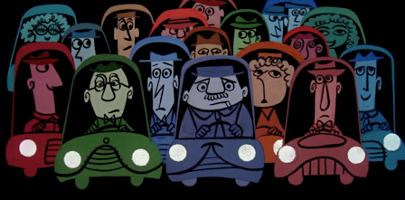
UPA stands out for their unique influential art style, experimental animation and visually narrative short films, truly sophisticated works of art. Another thing that set UPA apart was the lack of the funny animal, slapstick comedy genre of Looney Tunes and Tom & Jerry, something Hubley voically wanted to go against to have animation be seen as an art. As someone who deeply admires UPA, I will say that even slapstick comedy (and comedy in general) is still an art, regardless what the Oscars and critics say, there's definitely a reason why the Warner Bros. and MGM cartoons are still fondly looked at today, because of their great writing, sense of timing and irreverent sensibility, something that does take a lot of work to make a cartoon a true classic. Many critics have pointed out how Chuck Jones's later works, such as Now Hear This and High Note were some of the more UPA-equse works at WB, showing how much Jones embraced this style, as opposed to the other directors at Termite Terrace, speculated because UPA won more Oscars and more critical acclaim than WB themselves. Another UPA type cartoon from WB is Robert McKimson's Bartholomew Versus the Wheel (1964) and Alex Lovy's Norman Normal (1968).
Now Hear This (1962) - Chuck Jones and Maurice Noble
Norman Normal (1968) - Alex Lovy
Bartholomew Versus the Wheel (1964) - Robert McKimson
Other studios were following suit to this art style too, other than Warner Bros., MGM, Walter Lantz, Disney and DePatie-Freleng Enterprise (Pink Panther) did this as well.
The Pink Phink (1964) - Friz Freleng and Hawley Pratt
Toot, Whistle, Plunk and Boom (1953) - Ward Kimball and Charles A. Nichols
I didn't watch any of UPA's works until a few years back, which was when I immediately fell in love with them and made even more of an impact on me as an artist and animator. When first looking at their cartoons, it made me see that there can be more than one way animation can be done, not just the "funny animal, slapstick comedy" routine I mentioned earlier. It's proof that you can do ANYTHING in animation, if you put your mind to it. Look at Japanese anime, there are tones of genres anime has dealt with that showcase the amount of variety in animation, so American cartoons can do the same damn thing, something I would encourage to anyone. Cartoons and animation can be done gracefully if not only you put your mind to it, but if you have the right people doing it, one who understands and knows their history of animation, knows the advantages of animation, and chance to show the public animation can be for EVERYONE!!!!!
My most favorite UPA shorts were Rooty Toot Toot, Fudget's Budget, Christopher Crumpet and The Miner's Daughter.
Rooty Toot Toot (1951) - John Hubley
Fudget's Budget (1954) - Bobe Cannon
Christopher Crumpet (1952) - Bobe Cannon
The Miner's Daughter (1950) - Bobe Cannon
When regarding Questo's World (my original webcomic), there are people who say the art style reminds them/looks like 90s Nickelodeon or Craig McCracken, which does feel more like a compliment than anything else to me. But the choice of these stylized and abstract backgrounds and character designs was a design style I knew I wanted to use in Questo's World, as it easily fit the subject matter dealt within the comic, as a person obsessed with symbolic, metaphorical and allegorical elements in media. But, I still like to think of the style I use in my comics as "Warner Bros meets UPA" kind of style.
In short, UPA shouldn't be this overlooked of an animation studio and proof that American cartoons have some kind of variety in their work. If you haven't seen any of them yourself, the first one I would recommend watching is Rooty Toot Toot.
It's nice to see some acknowledgement of UPA's existence, in honor of this video. So, shout out to The Royal Ocean Film Society's YouTube channel.
After 12 hours of painstaking painting cels front and back, and mixing different colors and lack of color ink (only brown ink), I finally managed to finish my experiment of a cel of my characters from the Questo's World webcomic. I had to paint the outline of Ms. Amor's hair and Candy's stripes on her sweater, as well as Candy's tail outline being black instead of pink, as there was no purple, pink and yellow ink.
Front:
Back:
Now, as I said in my previous post, I wanted to compare the look of the characters from cel to digital.
Now there's obviously always a differences between the look from cel and digital ink-and-paint. The colors are less vibrant and the outlines are thicker. I've been undecided of the size of the outlines of Questo's World, wanting to make thick and thin to give it an old cartoon look.
As I've said, if it's possible, I would want Questo's World to be cel-animated.
I finally got much of items I needed to do what I've been desired for quite a while; making my own animation cel. I've been thinking for a while: how would my characters look like in cel animation, as well as other animated shows that were initially digitally animated.
I still wish this technique was still in use today, getting to nice feeling of that the animation done by human hands rather than technology, especially with the rise of A.I. supposedly taking over.
Did the pencil sketch of the Questo's World characters; Questo, Mickey Houndfair, Ms. Amor and Candy Cottontail.
Partially finished inking of the characters
This is my first time doing something like this. It's, of course, very difficult when compared to digital ink-and-paint.
Obviously, the inking is pretty rough, but it'll be cleaned up once I do the painting.
Got me some:
*Speedball Ink Pen
*Different color ink
*Acrylic paint
*Blank stencil sheets
Next post will include the finalization of the cel, and likely compare the colors and overall look to digital ink-and-paint.
I forgot to make a post of this months ago, but here's a watercolor painting of my backyard (September 2022). Mind you, this is my first watercolor painting. I would've done a post of the penciling of this, but it's too late.
I've been using digital art softwares more than I do traditional art. But, thanks to my love of experimenting, I'm willing to try out traditional art, at least, after a short while. There are a lot of things I love about traditional art that digital art makes too easy and a little boring for me, is mixing colors, feeling paper and painting with patience.
Watercolors does calm me down, so I do these things on occasions.
One day, I'd like to do a cel painting of my Questo's World characters, just how animation was done in the Golden Age.
Was out the other day and saw this amazing shirt with, not only the Looney Tunes characters, but some of the LT characters in their designs that look like something out of the classic shorts rather than the more streamlined look that's commonly seen in a good deal of the merchandise for many years.
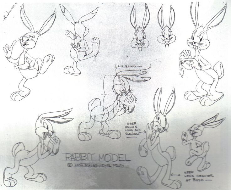
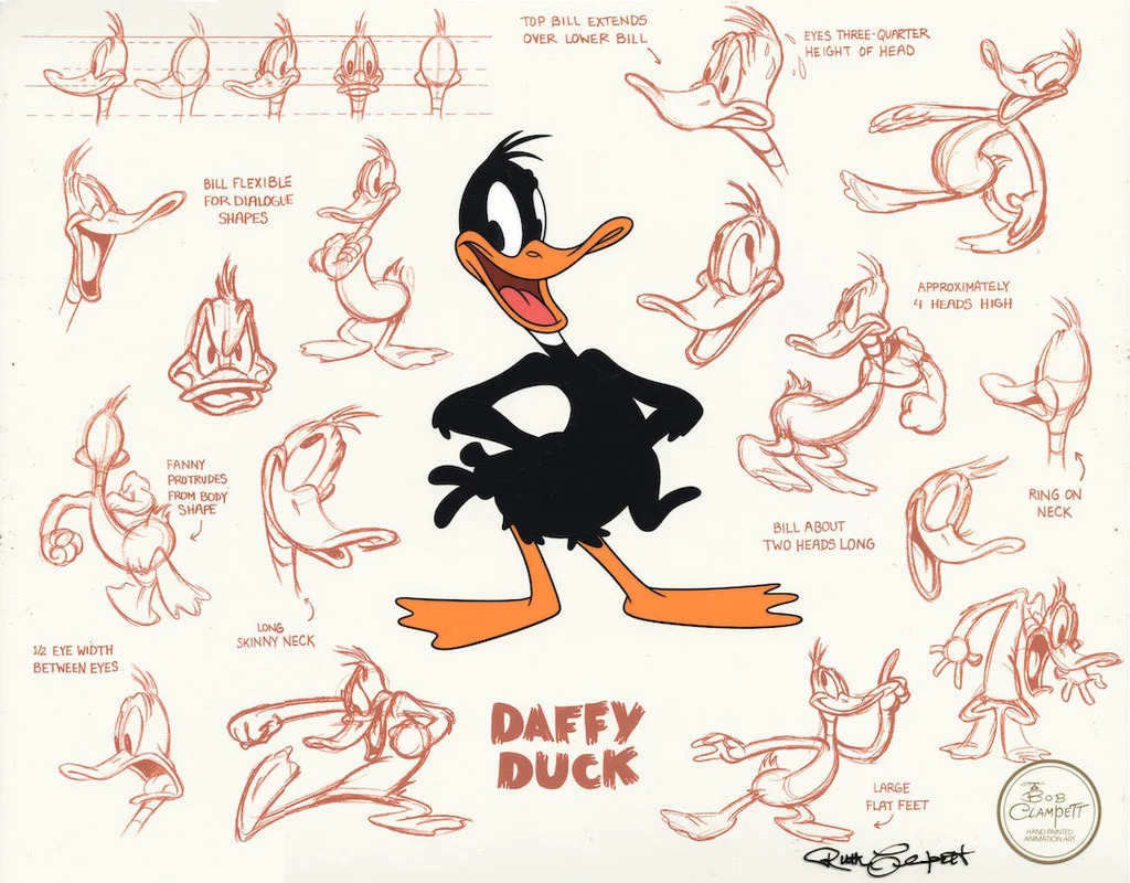
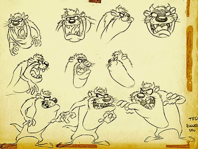
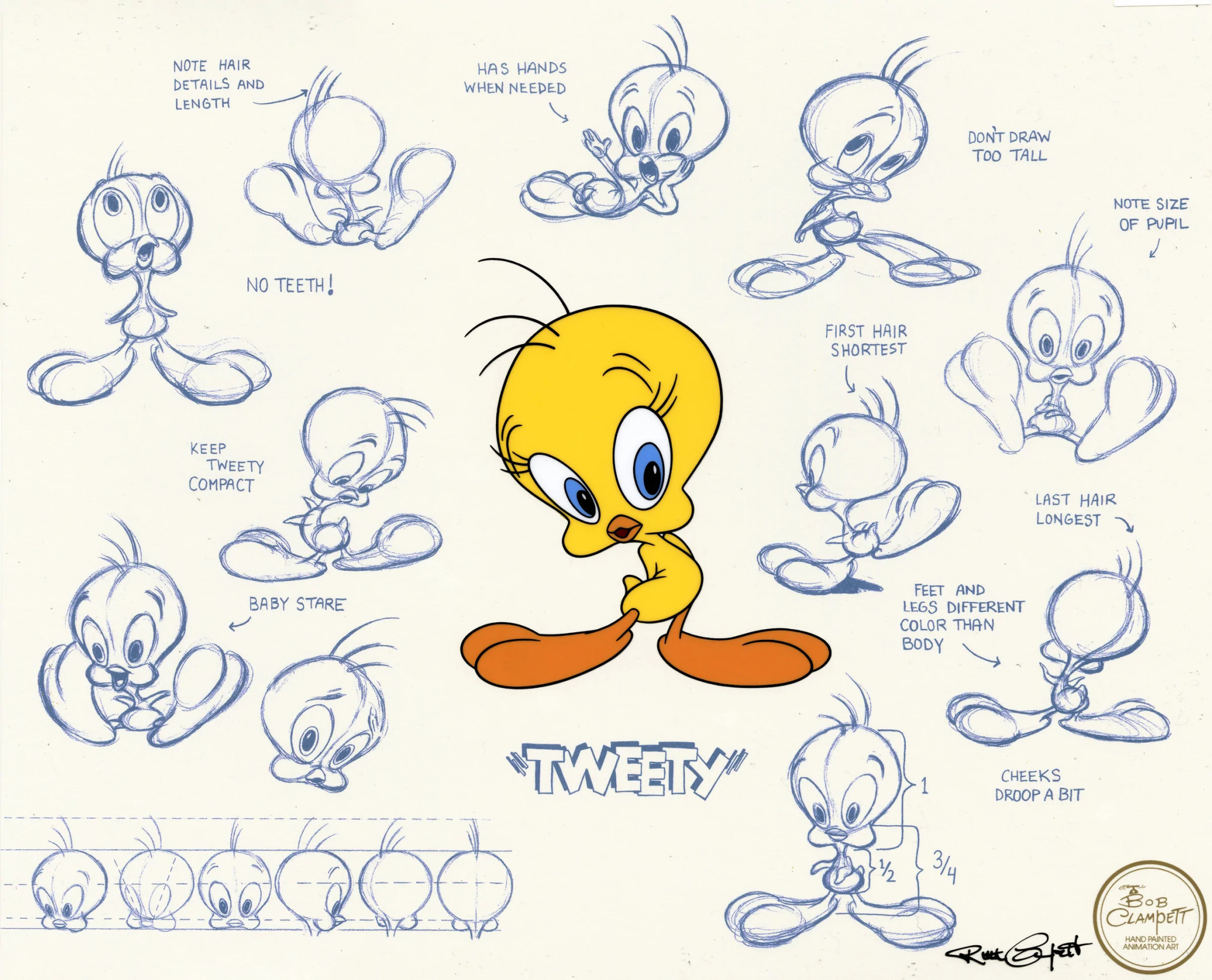
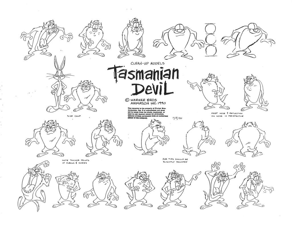
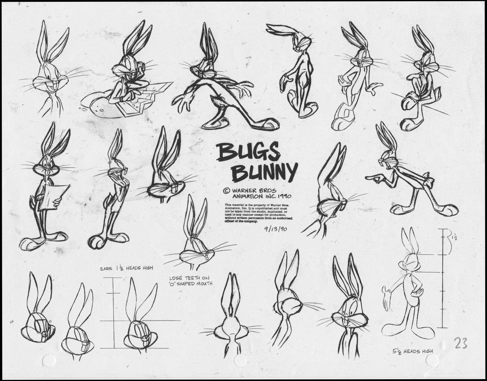
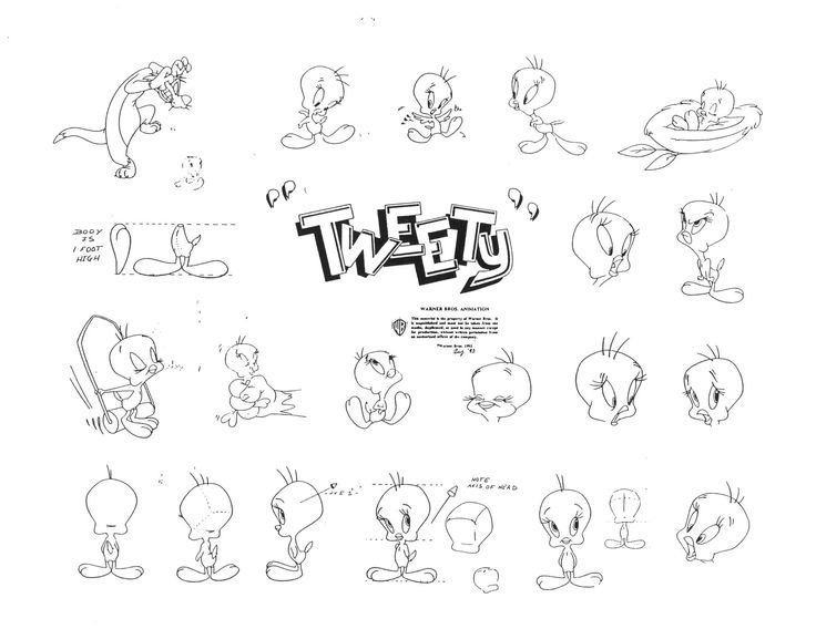
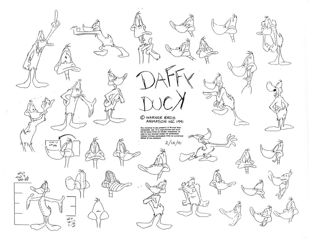
The Bugs, Daffy and Tweety in this shirt definitely look like they came straight out of a Bob Clampett model sheet, and especially that Sylvester, while that Taz is faithfully drawn like how his creator, the unappreciated Robert McKimson, designed him. Merchandise like these only come once in a blue moon, folks.
Bugs Bunny Tex Avery model sheet of 1940's A Wild Hare
Daffy Duck Bob Clampett model sheet
Robert McKimson Taz model sheet
Screenshot of Sylvester from 1946's Kitty Korned by Bob Clampett
Screenshot of Tweety from 1944's Birdy and The Beast by Bob Clampett
Bob Clampett Tweety model sheet
Now compared that to their more modern, simpler appearances:
For any fan of the original Looney Tunes and Merrie Melodies cartoons or just animation in general, this is shirt that I would highly recommend. It feels like it was done by someone who truly understood what fans wanted and took the time to look around the Warner Bros. department or whatever to find the sheets of the original directors. It feels like for how famous the Looney Tunes are, that the directors from Chuck Jones to Friz Freleng, never get as much acknowledgement as the characters they helped created, and so I'm glad that, when seeing this shirt, I can see that someone probably must've either looked at the original cartoons or just dug out the original model sheets. Maybe I'm just being too obsessives over just a shirt with cartoon characters on it, but things have to be worth SOMETHING at the very least, is my general philosophy.
If anyone from WB is reading this, please note that THIS is what WE as fans want.